Radical cost reductions in technology – illustration from external hard drives

Storage costs are about zero.

Got to thinking about the cost of storing data on external hard drives. Did a few calculations to look at the radical change in costs over the last few years. Used my actual purchases and listings today at Amazon. Wow.

Here are the costs per gigabyte of storage for the newer portable hard drive (2 of ‘em are about the size of a paperback book) and for the larger externally powered ones (more the size of a thick hardback): (more…)

Does it feel like the recession is over? Here’s a graph to show why you said no

The recession officially ended in June 2009. Broad economic stats confirm that.

And yet…

Does it feel that way to you?

Me neither.

The employment data is making it feel like the economy is still in a lot of distress. Here is a graph that, I think, shows why I’m sensing some distress.

(more…)

Here is what my eye sees in the inflation data – a big increase starting in December 2010

Been thinking about the inflation data I posted earlier today. Also been thinking about data visualization – how do we accountants present data so other people can see what we see.  Lets go back to the monthly inflation data for the last 2 1/2 years.

I see a major change at the end of 2010. Inflation moved from a plateau of reasonable amounts (all things considered) to a high level.  All at once.  How to show that?

(more…)

Inflation watch

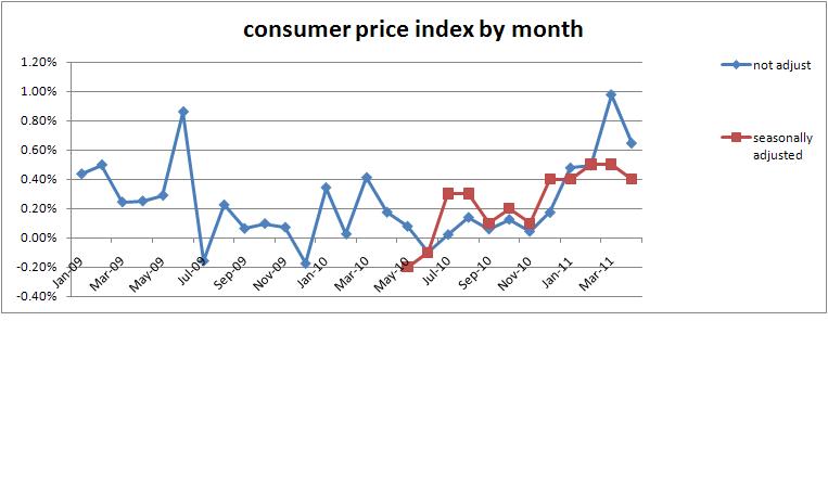
April inflation data is out. Adjusted for seasonal factors the increase was 0.4%. Without seasonal adjustment it was up 0.6%.  That makes adjusted increases for last five months 0.4, 0.4, 0.5, 0.5, and 0.4. Not good numbers and a worse pattern. That’s a 2.2% increase in consumer prices in five months.

Put the data into a graph like last month. Also added the adjusted amounts. Here’s the graph:

(more…)

Cheapeners make life really fantastic for all of us – the radical cost reductions in technology

It isn’t the initial idea of a technology that makes life so fantastic for all of us. It is the next round of people who figure out how to make it ridiculously cheap that lets everyone enjoy the really cool inventions. So explains Matt Ridley, of the Wall Street Journal, in Three Cheers for the Cheapeners and Cost-Cutters.

 “A feature of innovation is that the greatest impact of a new idea comes not when the light bulb goes on over the geek’s head, but when the resulting technology eventually becomes cheap enough for many people to use—perhaps decades later.

This is the driver behind the tremendous productivity gains in the last few centuries.

(more…)

Does humanitarian aid actually help? How do we know?

Outcome measures are being forced on ministries. Does this organization actually create change in the area of their cause? Ultimately, answering that question will be a good thing, even though it is very hard.

How about asking the same questions of humanitarian aid? Does the help provided actually make the lives of struggling people better? How do we know?

Measuring How and Why Aid Works – or Doesn’t, written by William Easterly in the Wall Street Journal, discusses two books that help us ask questions. The same concepts apply to aid as to domestic non-profits. Are they making any difference?

Mr. Easterly focuses in on the core issues when he says:

(more…)

Rappin’ economists, round 2. Yes, rapping. Yes, round 2.

The great economists Hayek and Keynes continue their rap encounters. This time they go to a congressional hearing and wind up in a boxing ring.

Check out Fight of the Century at EconStories.

[youtube=http://www.youtube.com/watch?v=GTQnarzmTOc&feature=player_embedded#t=447s]

Some of my favorite lines:

(more…)

Is inflation back?

Various news reports suggest that inflation is returning to the economy.  See this article from the AP for one example: That’s pricey: 13 items that cost more, or will.

Officials of the Federal Reserve indicate the recent price increases won’t be sustained. 

I decided to do some checking on my own.

I pulled down the CPI data for a look-see.  See this post for links to get the data yourself.

(more…)

Comparing GDP of US states with foreign countries

You’ve played the word game — if California was a separate country, it would be the Xth largest economy in the world.   

The Economist magazine has revised the game with a graph that matches the GDP of each state with another country with the closest GDP.  Map is here.  The ‘population’ button at the top changes the map to match each state with a country with the closest population size.

A few fun observations:

(more…)

Why are cartoons such a popular explanation of economics right now?

Amity Shlaes, in her current Forbes column, Economics by Cartoon, points out that the cartoon Quantitative Easing Explained and the rap debate between Keynes and Hayek have received 3.5 million and 1.7 million hits on YouTube, respectively.  I’ve mentioned these videos here on this blog and here on my other blog.  (Just checked – the QE cartoon is up to 4.0 million visits.)

Over 5.7 million hits on YouTube video explanations of what is going on?  Why?

(more…)

Economic development makes every country healthier and richer

Incredible visualization of 200 years of economic development and improvements in health around the world.  A professor creates an entertaining visual of how health and wealth has increased in 200 countries over 2 centuries.  Does it all in under 5 minutes.  (more…)