Might want to not tell your vaccine hesitant friends and family about this discussion.
I have been tracking a lot of data about Covid since the start of the pandemic.
Why? The data is subject to interpretation, misinterpretation, delays, and manipulation.
So again, the question is: Why?
Publicly available data is what our supposed leaders are using to make decisions. By watching the public data we can maybe guess what they are about to do to us.
Anyway, I have been watching the data. Also have a large number of graphs set up so I can better see data and trends.
Something weird is happening with the vaccination.
Fully vaccinated people are getting sick. Lots of them.
People I know who are vaccine hesitant are noticing.
This is where hard numbers come into play.
I don’t know what these numbers tell us about what may happen soon, but the picture I see is distressing to me.
One set of data I have been watching is from North Dakota.
They make a lot of data available, which you can access at their dashboard here. One nice thing about the North Dakota Department of Health is they update the dashboard almost every day, only skipping updates once in a great while.
This is in radical contrast to the County of San Bernardino which updates their information around two times a week, or maybe three, or maybe once. As a result, graphs of data for San Bernardino County (where I live) look odd and that it difficult to discern any kind of trends for the county.
One additional way North Dakota tracks data is by breakthroughs. They backtrack and find out the status of everyone who’s been reported positive and determine whether the person has been fully vaccinated or not. The particular tab for breakthroughs, found here, is continually updated as they gather additional information.
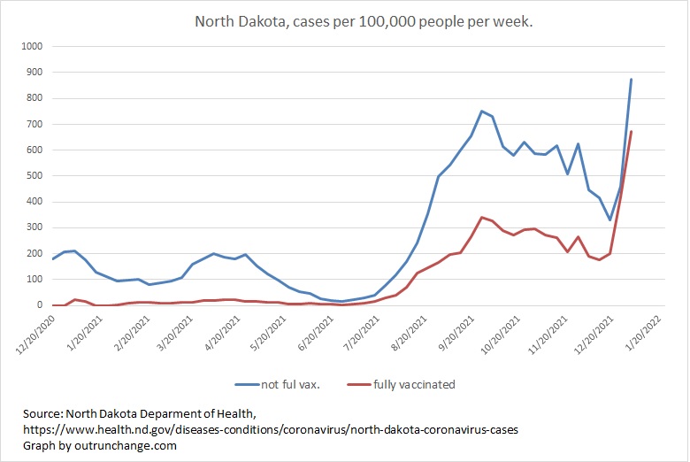
A graph of the cases per 100,000 people broken out between fully vaccinated and not fully vaccinated can be seen at the top of this post, with data from week ending 12/20/20 through 1/2/22. Data for the last week is going to change and data for the two earlier weeks will probably shift as well.
Let’s look at the graph in a little more detail.
The proportion of cases per hundred thousand amongst not fully vaccinated to cases per hundred thousand amongst those fully vaccinated was running high until about July. The ratio was 10:1 or higher until the middle of May. Then the ratio of cases amongst unvaccinated compared to vaccinated dropped to something in the range of 6:1. In other words the proportion of people fully vaccinated who were getting sick was increasing slightly.
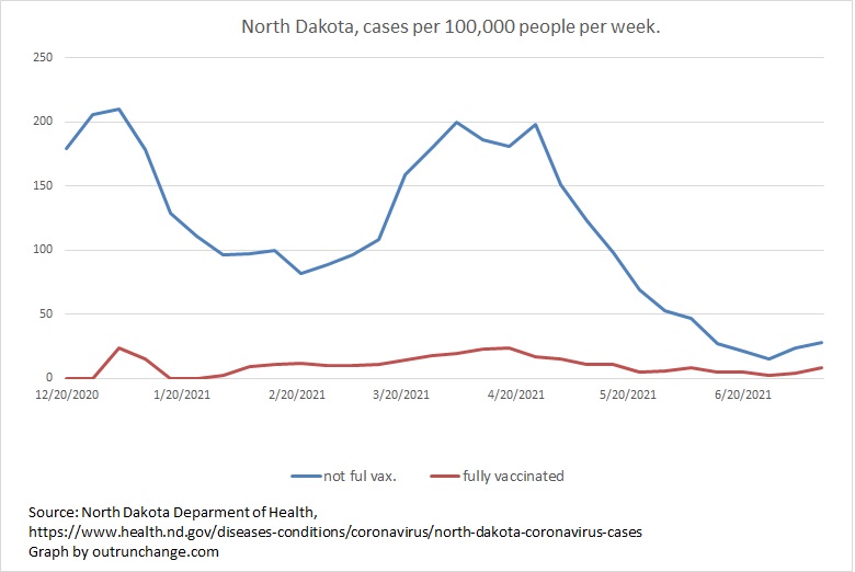
The count per 100,000 through week ending 7/4/21:
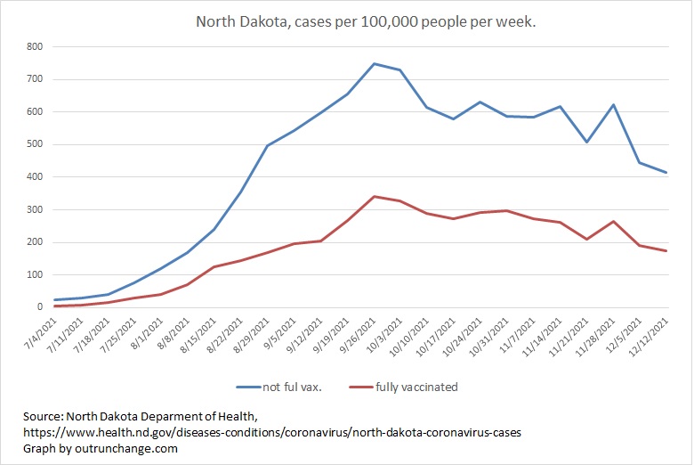
Let’s roll that forward, looking at the cases per 100,000 amongst vaccinated and unvaccinated from the week ending 7/4/21 through 12/12/21.
What we see is the reported infections amongst those who are fully vaccinated rising in relation to the number of unvaccinated cases. As the number of cases overall increased in August the ratio of unvaccinated cases per 100,000 unvaccinated per 100,000 vaccinated shifted from around 6:1 in June to about 2.5:1 in July and August, and declining to something the range of 2.4:1 down to 2.0:1 in September, October, and November.
The count per 100,000 from week ending 7/4/21 through 12/12/21:
Lastly let’s look at what happened in the last couple of weeks.
Case counts accelerated dramatically, which presumably is the omicron variant spreading around. The distressing feature, which is the point of this discussion, is the virus is spreading far faster amongst those are fully vaccinated than not vaccinated.
More to the point the ratio of cases per 100,000 amongst those who are not vaccinated to those who are fully vaccinated has shifted from around 2.4:1 in November and December down to below 2.0:1 starting the week of 12/19/21.
Next graph is the count per 100,000 from week ending 12/5/21 through week ending 1/2/22.
Keep in mind the numbers for the last two weeks will shift. However, I have been watching this data for a couple of months now and the shift in data is noticeable, but it is nothing close to the change in ratios observed in the last three weeks.
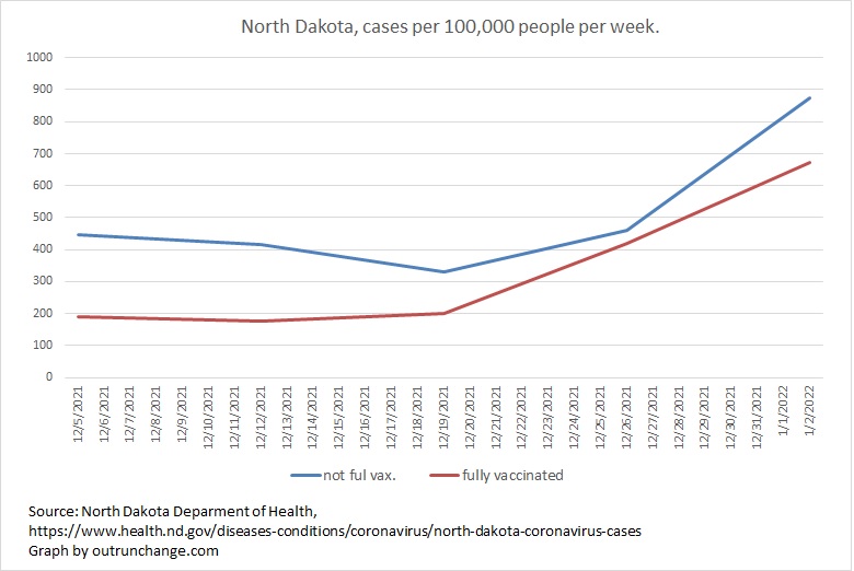
For more detail , here is the ratio of cases per 100,000 amongst unvaccinated to cases per 100,000 amongst fully vaccinated for the last several weeks:
- 1.3 – week ending 1/2/22, ratio of cases per 100,000 amongst unvaccinated to vaccinated
- 1.1 – weekending 12/26/21
- 1.6 – 12/19/21
- 2.4 – 12/12/21
- 2.3 – 12/5/21
- 2.4 – 11/28/21
Something weird is happening. I have only seen one other discussion of this issue. Won’t mention that specific article, but will continue to look for other coverage on the deteriorating protection provided by the vaccination.
By the way, we were sold on getting vaccinations on the basis it would provide 95% effectiveness. That is not a guarantee. However, that 95% effectiveness should be producing a ratio of cases per 100,000 unvaxed to vaxed of around 19:1 or 20:1.
North Dakota was running merely 10:1 until dropping to 2:1 and now running below 2:1.
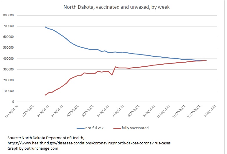
For context, here is my calculation of the number of people in North Dakota who are fully vaccinated and unvaccinated, which is extrapolated from the case count per 100,000 and the actual case count:
Thanks for your data! My wife and I were both dual vaxxed by the middle of April 2021. Just recently we both contracted covid. We have (had) mild cases but it was covid nonetheless. What you have shown in the graphs is something I have wondered but I only had anecdotal info to evaluate. I appeciate your efforts.
Hi Jeff:
Sorry to hear you had your turn at battling covid. So very glad to hear you two were not hit hard.
I will not post the data yet, but in North Dakota for the week ending 1/2/22, the number of vaxxed people catching the virus was greater than the number of unvaxxed. The cases per 100,000 people was higher for vaxxed than unvaxxed. Those numbers may change because the state appears to modify the tally as they gather additional information about each case. But if the numbers hold, that would give a negative number for efficacy for the week.
There are a few reports from locations in Europe and a few places in the US where the case count per 100K is higher for vaxxed than unvaxxed. When a few more of those reports surface, I will discuss them in a post.
Thanks for reading and thanks for taking the time to comment. Hope you are fully recovered soon!
Jim