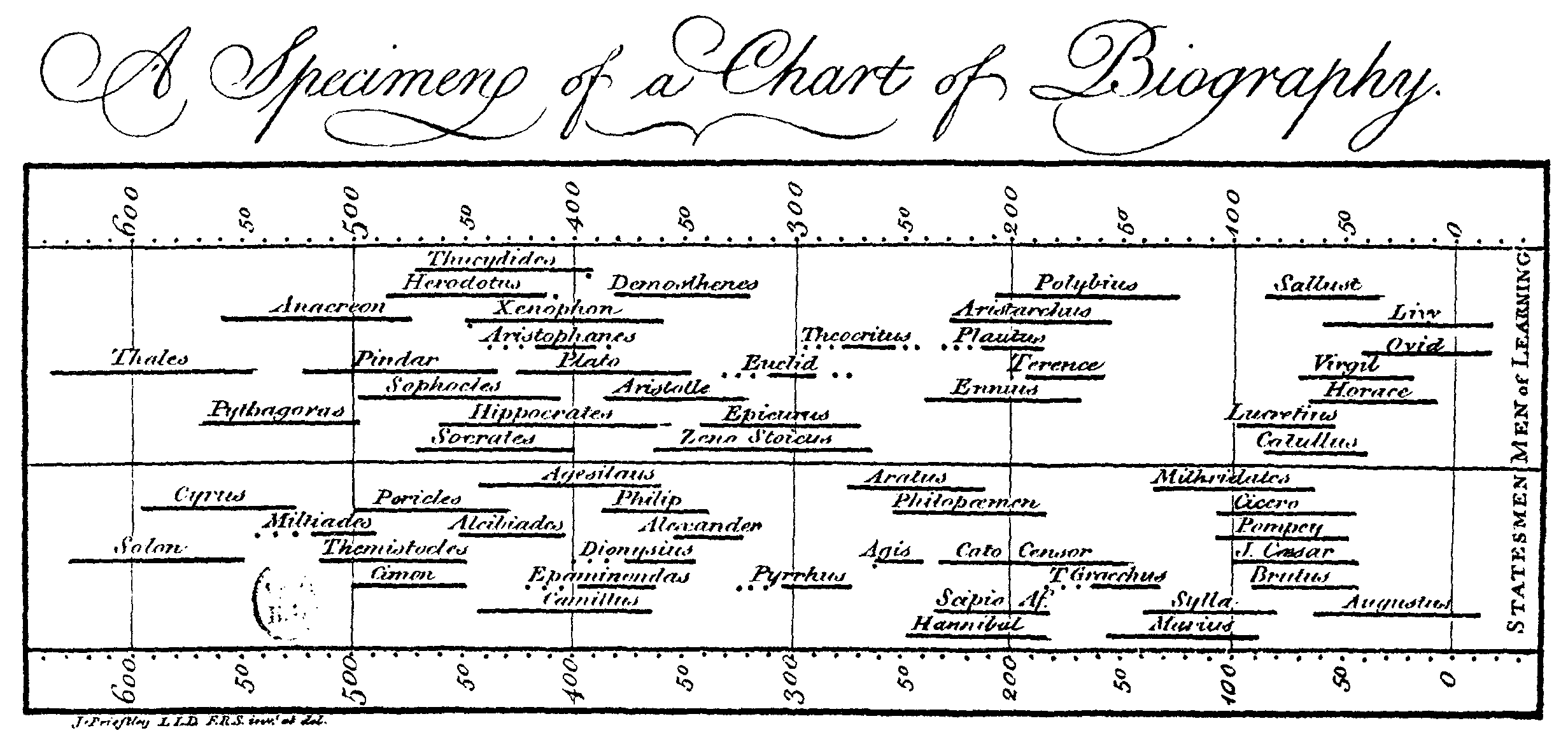
“The 5 Most Influential Data Visualizations of All Time” is a great collection of some of the most creative ways to present large volumes of data in such a way that the data tells its own story. When you ponder these visualizations for a few moments, you easily grasp the story hidden in the numbers.
Way cool.
I’ll have much more to say later. There are a half-dozen posts in that material. So much for us to learn from those examples.
Gotta’ point out that Gapminder is the site where you can see all of Hans Rosling’s data visualizations. You can pause, look at one year, rewind, change scale, change indicators. Fantastic.
Here are a few others:
Gapminder – per capita income and life expectancy by country by year, 1800 to 2011
Causes of death in Crimean War
hat tip: Carpe Diem