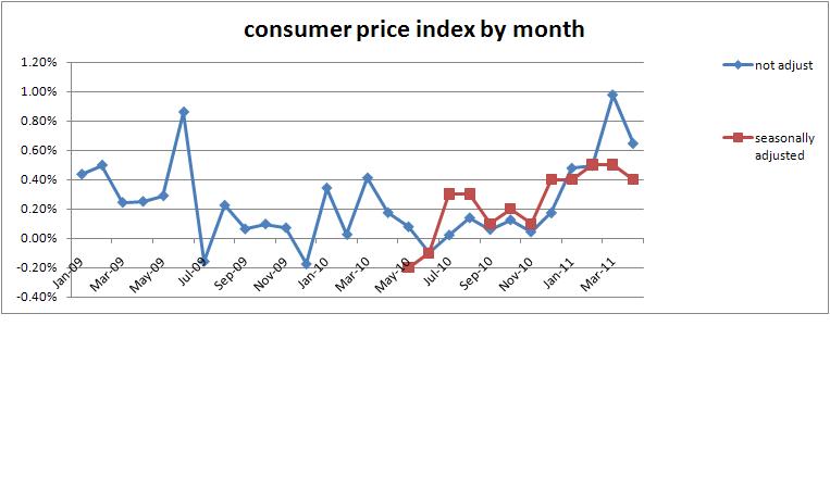
April inflation data is out. Adjusted for seasonal factors the increase was 0.4%. Without seasonal adjustment it was up 0.6%. That makes adjusted increases for last five months 0.4, 0.4, 0.5, 0.5, and 0.4. Not good numbers and a worse pattern. That’s a 2.2% increase in consumer prices in five months.
Put the data into a graph like last month. Also added the adjusted amounts. Here’s the graph:
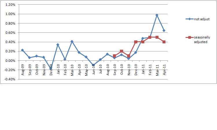
That shows my accountant’s eyes that there was a change in the pattern starting in about December. To make the pattern more obvious, I dropped out the fluctuations in the unadjusted amounts in summer ’09 and the adjusted amounts from May ’10 thru August ’10. Here’s what I see:
There is a shift in the trend starting at the end of 2010. Hopefully you can see that as well.
Click on the graphs to see a larger version.

