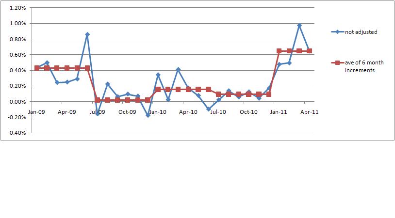
Been thinking about the inflation data I posted earlier today. Also been thinking about data visualization – how do we accountants present data so other people can see what we see. Lets go back to the monthly inflation data for the last 2 1/2 years.
I see a major change at the end of 2010. Inflation moved from a plateau of reasonable amounts (all things considered) to a high level. All at once. How to show that?
How about taking the inflation data in six months intervals? I calculated the average change for six month periods, consisting of the first and last 6 months of each year.
Now you can look at the following graph and immediately see what I see:
