Various news reports suggest that inflation is returning to the economy. See this article from the AP for one example: That’s pricey: 13 items that cost more, or will.
Officials of the Federal Reserve indicate the recent price increases won’t be sustained.
I decided to do some checking on my own.
I pulled down the CPI data for a look-see. See this post for links to get the data yourself.
What I found is that inflation has been pretty low for quite a few years, especially the last year and a half.
However in January, February, and March of this year there has been a change in the pattern. Seasonally adjusted inflation was 0.5%, 0.5%, and 0.5% in each of the last three months. Continue that for a year and we are looking at consumer prices being 6.0% higher in December 2011 than they were in December 2010.
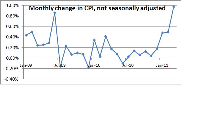
Without seasonal adjustments, inflation for the last three months has been 0.5%, 0.5%, and 1.0%. Adjusted or unadjusted, that is a rather marked change from the previous several years.
I pulled the data into a graph so you can see the trend yourself. Did this for two reasons: so I can figure out how to put graphs into my blog and so you can see the trend line. Here’s the graph:
 (Click on graph to see larger version.)
You can see a spike in June 2009 with a reversal in the following month. Other than that, things are cruising along relatively low. Starting in January 2011 there is a big jump.
This will be worth watching. Perhaps we are just seeing a quarterly spike. Perhaps we are seeing a return of rather unpleasant inflation.
(several minor editing updates made – so small I won’t highlight them.)